


Mastering the Pareto Chart for KPI Analysis
Identify Root Causes and Drive Continuous Improvement

The Pareto Chart in Presto PDCA is a powerful tool designed to help teams visually analyze KPI performance trends and prioritize root causes based on their impact. Inspired by the 80/20 principle, this chart enables users to focus on the most critical issues that drive performance gaps, helping leaders take targeted actions for sustainable improvement.
In this tutorial, we will walk you through the process of assigning root causes to a KPI result (see exercise 4.1.6 for root cause set-up -) and then generate a Pareto report directly from the dashboard.
By learning how to use this tool effectively, you'll gain a deeper understanding of performance challenges and develop data-driven strategies to enhance business outcomes.
Step-by-Step Video Guide
Watch this short explainer video to see how to assign root causes and report them using the Pareto Chart.
Using the Pareto Chart
Part 1. Access the Pareto Chart
1. From the KPI dashboard, select the KPI(s) to be reported

2. Click here to access Presto's Pareto Chart

3. Congratulations! You have accessed the Pareto Chart!

Part 2. Updating the Pareto Chart
Tip! The quality of the Pareto Chart is dependent on how accurate and disciplined you are in capturing root causes with each historical KPI result
4. Root Causes are captured by accessing the historical details panel. Click here to enter root causes

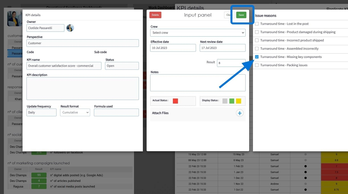
5. In this exercise, we will enhance the result details of the KPI for the 3rd of July. Do so by accessing the 'Additional Fields/Formulas' pop-up screen. (click here)
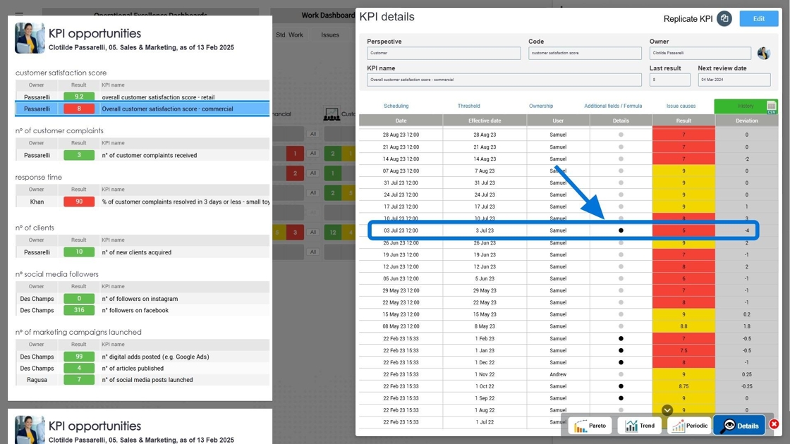
6. Review the list of root causes previously configured. If this list is not complete, see training showroom exercise 4.1.6

7. Select 1 or more root causes & save
Congratulations! You have finished the exercise on Root Cause Analysis & Pareto Chart reporting